Relationship building with your customer base is the best way to ensure they return to your theatre for future events, and an easy way to do that is by making their ticket purchase experience as smooth as possible.
Using reserved seating supports an audience member’s engagement and excitement right from the point of purchase, and is a great way to begin building that relationship from the start. To help support them, you want to be sure that the interactive seating map you are offering them is easy to read and understand. We’ve got some helpful seating map design tips and tricks to make sure that’s the case, so you can avoid common pitfalls to improve audience satisfaction and reduce box office headaches.
How does reserved seating help my organization and my customers?
Reserved seating is more than just a way to assign spots; it’s a way to create a smoother, more enjoyable experience for everyone involved, and a way to build your relationship with your audience right from the point of purchase.
For your organization, reserved seating is an opportunity to streamline your event processes. It will support your box office staff in the day-of operations, being able to easily guide customers to seats and keep lines moving quickly. It’ll help your team manage audience flow, and even gives you the opportunity to vary pricing levels based on seating, or create elaborate seating map layouts to accurately represent your venue and create a holistic event-going experience.
For your customers, reserved seating supports their engagement with you right from the beginning, while providing them peace of mind on event day. They know where they’ll sit and with whom, and won’t need to rush to grab a spot when doors open. It gives them one less thing to worry about, and giving your audience information up front is a sure fire way to help them enjoy their experience.
The benefits continue after your event, too – you’ll be able to see powerful post-event data, like what sections sell the fastest, where you can offer special pricing, and in turn, how to plan your next event more effectively.
ACTION STEP: Gather the details of your event space so you can make a reserved seating map for your next event.
Mistake #1: Confusing seat numbering or labeling.
One of the most common issues venues face is inconsistent or confusing seat labeling. When rows aren’t clearly marked, numbers skip around, or the layout they had chosen seats from online doesn’t match what guests see in the venue, it’s easy for frustration to build.
When labeling your venue seating map, we recommend having clear, distinct titles for each section (for example, labeling from the perspective of how an audience member would enter the door, like “front left” being closest to the stage, and to the left if the auditorium if you are sitting in the seat), and distinct seat and row labels (for example, labeling rows with letters and seats with numbers or vice versa, and labeling “1” or “A” as the closest to the stage).
If your venue has labels in the space already, like if your auditorium has seat plaques, review your auditorium and note and discrepancies or doubles that might exist. Many theaters omit the letter ‘L’ or ‘O’ to avoid confusion, so always be sure to double check these rows.
ACTION STEP: If you are designing the labeling of your space, try to choose different row and seat labeling. If your space has existing labeling, note anything that might confuse your audience.
Mistake #2: Lack of accessible or obstructed-view seating options.
Creating an equitable and accessible space is necessary when working to make your company an inclusive one. This is done both by providing accurate information to your audience, and making sure you’re meeting access needs wherever possible.
Flagging any seats with partial or limited views provides your audience with transparency, which not only avoids confusion but also builds trust that your organization values each ticket buyers experience. You could even consider pricing those seats differently, so there’s an option for those who might need a discount in order to attend your event.
Additionally, marking your accessible seating areas, areas to sit if you have sign language interpreters, and more will demonstrate to the audience of your inclusive practices and help them in choosing the seats that will serve them best.
ACTION STEP: Review your venue for limited view seats and for your accessible seats, then mark them on your map.
Mistake #3: Inaccurate map or capacity data.
Even a well designed map cold cause confusion if it doesn’t accurately reflect your space. If your rows don’t line up, aisles are missing, or seat counts don’t match actual house capacity, it can lead to confusion and to overselling. Avoid the unnecessary headache of dealing with customers who have bought a ticket to your event, but end up without a seat.
Your seating map isn’t just a visual selling point, it’s a reflection of your organization as a whole. By showing a space that is accurately scaled and honest, you’re setting yourself up for success on the day of your event as your guests will know what to expect.
ACTION STEP: Take the time to double check your capacity, and to review your seating map in detail to ensure it’s precise.
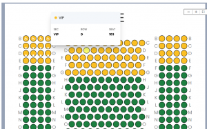
Mistake #4: Poor communication of seat categories and pricing.
One of the most important elements in making a final sale is the price of the ticket – and that it’s been communicated clearly. Ticket buyers will be confused if the pricing is unclear, or seating categories seem muddled. When they are choosing their tickets, they will want to see clear delineations of price between sections when applicable.
This is easy to do within the BookTix seating map – you can add color coded sections and distinct labels to demonstrate how the categories and pricing differ. This helps the buyers understand their choices clearly, which makes their decision easier, and makes you look more organized and professional.
ACTION STEP: Review your current seating map and decide if you want to delineate by different prices per section. Make sure seat categories are easy to distinguish and prices are clearly explained. If possible, add visual cues or short descriptions to guide buyers as they select their seats.
Best Practices:
Simple rules to get it right every time
Creating a clear and accurate seating chart doesn’t need to be complicated, but taking a bit of extra care can make all the difference. Here are some best practices to ensure ease of use for your customers, and for your organization.
- Ensure your digital map mirrors the physical layout accurately
- Check and edit any numbering, row labeling, and section titles to be as clear as possible
- Clearly mark accessible sections or partial view seating
- Have distinct delineations between pricing sections via color coding and labeling
ACTION STEP: Test out your customer site, and think of the check out process through the eyes of the customer. Note and adjust any necessary seating chart edits to ensure customer clarity.
A well-designed seating map isn’t just a visual for the ticket buyers to interact with, but a reflection of your organization’s professionalism and care for it’s audience members. By guiding them through a well thought out process, you set the tone for their experience when interacting with your organization as a whole.